Correlation
In
order to measure if there is any correlation between the distances someone is
away from the sound source and the level of the sound measured in decibels (dB)
there are tools in both Microsoft Excel and SPSS to create scatterplots and
measure Pearson’s Correlation.

These
values listed above in the table were entered into Excel with the purpose of
seeing if a correlation existed, and if there was a positive or negative trend
associated with the data.

Lastly,
this data was used in SPSS to measure for the Pearson’s Correlation to
determine what kind of correlation, positive or negative, and how strong it
was.

The
two data sets have a -0.896 Correlation. This number means there is a very
strong negative correlation, suggesting as distance away from the sound source
increases, decibel level decreases.
SPSS
can also be used to create a correlation matrix, which takes all the variables
you are testing, and compares them to one another. We used basic Detroit Census
data and found strong relations ( + 0.6) existed between;
White and Black residents (negative)
White and having a Bachelor’s Degree (Positive)
Median Household income and Bachelor’s Degree (Positive)
Median Home value and Median Household income (Positive)
White and having a Bachelor’s Degree (Positive)
Median Household income and Bachelor’s Degree (Positive)
Median Home value and Median Household income (Positive)

Part II
INTRODUCTION
The
Texas Election Commission (TEC) is curious about the democratic voter breakdown
from the 1980 and 2012 Presidential Elections. The TEC wants someone who is
capable of analyzing the voting patterns across the state as well as voter
turnout. With this the TEC is hoping to be able to identify voting patterns and
clusters throughout the state.
METHODOLOGY
Once
all the data has been gathered and entered correctly into a shapefile in
ArcMap, the next step is to open that shapefile up into Geoda and begin running
spatial autocorrelation tests on it. These tests have to be weighted, and for
that we just used the standard settings for the Poly ID field. Spatial
Autocorrelation tests the individual counties in either rook or queen style
testing. Rook uses the counties
above, below and side to side for analysis, while the queen style uses all the touching counties.
Two
types of tests will be run on the data, the first being Moran’s I and the
second being LISA Maps (Local Indicators of Spatial Association). Moran’s I
measures “randomness” amongst the data. Using areas next to each other, Moran’s
I describes the spatial autocorrelation differences amongst several
geographies. Other major uses this method has, tests for difference in dialect
in certain places. LISA Maps use the same data but this time produce a map. The
maps will show 4 different colors, Dark Red, Light Red, Light Blue, and Dark
Blue. The colors represent, High to High, High to Low, Low to High and Low to
Low respectfully.
RESULTS

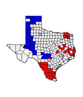
In
this map we see several blue counties in the northeastern portion of Texas and
several red counties in the south. This is showing that the 1980’s election
(Democratic Votes) was high in the south and several counties were low
democratic voting in the north. The graph shows a semi strong trend going in
the positive direction for the 1980’s Democratic Presidential Election Data.


In this map we see similar data, blue counties in the north, not as many as in 1980, and we also see more red counties appearing in the southern portion and now western portion of the state. This data is showing the 2012 Democratic Votes for Texas. The graph shows an even higher positive trend for the data, nearly .7 in the positive direction.


This
data showed us a wide variety of counties, with very little trends, except in
the northern portion of the state. Percentage of people of Hispanic decent throughout
Texas shows the north is mostly counties of little to no Hispanic people, and
the counties in the south near the border are more likely to be Hispanic. The
graph shows very little positive trend and is very spread out, may have to look
back into it to see if it was done correctly.


The
1980’s voter turnout in Texas showed high numbers in the north and low numbers
in the south. The red counties indicate the high to high counties and blue
indicate the low to low. The graph shows a positive trend line around .46. Most
counties with the exception to the eastern and central red and blue counties
are generally grouped up.


The
2012 voter turnout in Texas looks similar in the southern portion of the state
when compared to the 1980’s map, but that is where the similarities stop. The
counties which were once red in 1980 have diminished or even turned blue. The Moran’s
I chart shows it at a 0.33, which is .13 lower than the 1980 voter turnout.
CONCLUSION
When
looking at the 5 maps we see several trends. One major trend which stuck out
was the Hispanic population in Texas, mostly found in the south according to
the data, showed little voter turnout when compared to the population, but the
voters who did show up showed strong democratic voting patterns. The state is
fairly split when it comes to voting democratic or not. Based on just using the
maps, and not including prior knowledge I would say that northern Texas is prominently
white republican voters, while the south is Hispanic democratic voters. Lastly,
adding on to that the maps are showing that voter turnout is increasing greatly
in the south and decreasing in the north.
The
people at TEC have been given some great information about what kind of trends
are going on throughout the state, and if given more data or possibly more in
depth data results and trend patterns could become more definite. Possibly even
using regression analysis or hot spot identification would lead to more
accurate data trend finding.
In this lab we used several different tools of correlation through different computer softwares.
Overall the tools are a great way to see if any features are related to one another and how strong of
a relationship the features have together. These tools have many real world purposes, calculating
trends in voting patterns is just one of many applications statistical analysis may have in a real world
situation.
No comments:
Post a Comment