Part 1
A
city is looking for an answer to an interesting question they have been trying
to figure out and were not 100% sure how to go about it. Using data for Town X
a local newspaper made the claim that as the number of students who get free
lunches increases so does the crime rate for the designated areas.
Using
Regression Analysis in SPSS we can test to see if there is any type of
relationship between the two data sets that the newspaper claimed to be true.
For this test we were given data sets for multiple areas of town X, this data
include crime rate per 100,000 people and the percentage of students who were
on the free lunch program. I decided to use the crime rate as the dependent
variable and the percentage of students who receive free lunches as the
independent variable. I chose to do it this way because we are testing to see
if the crime rate increases as more students receive free lunches.
Therefore
for this test scenario, the crime rate is dependent upon how many students are
receiving the free lunches at school. An argument could be made to flip the two
variable and make the crime rate the independent variable and say the number of
students who get free lunches is dependent upon the crime rate, but for the
sake of this study I felt the originally mentioned way made the most sense.
I
initially created a scatter plot in Microsoft Excel to get a general idea if
there was any type of trend line associated with the data before I ran the data
through SPSS (figure 1). I found a
small linear relationship (based just on looking at it) and also found one set
of data that seemed way out of place, will address that issue later.
 |
| Figure 1: Chart created using Microsoft Excel showing the trend line |
After
performing regression analysis in SPSS I found an r2 value of .173
at a significance level of 0.005 (figure
2). With this data I can reject the null hypothesis because there is a
linear relationship between students who receive free lunches and the crime
rate. The town then had a new area which has 23.5% of students receiving free
lunches and wanted to know what the potential crime rate could be. Using the
equation Y = 21.819 + 1.685(x) and
inserting 23.5 in for X we get a crime rate of 61.4165 per 100,000 people. When
asked how confident I am about the data I cannot give a full certainty answer
because the graphs only can account for about 17% of the data.
 |
| Figure 2: The data gathered from running regression analysis on the crime/lunch data |
As
mentioned before there was one outlier in the data. Curious to what the data
would look like I deleted it and ran the regression analysis again using the
same dependent and independent variables as before. After running the test the
r2 value nearly doubled to 0.389. The crime rate per 100,000 people
also declined to 60.816 when the students who receive free lunches is at 23.5%.
If we chose this data set instead of the original data we can be much more
confident with our answer because the model can explain almost 40% of the data.
The equation used for this was Y = 31.77
+ 1.236(x) where X was 23.5.
Part 2
Methods
The
second part of this assignment is to analyze and interpret any statistical
patterns amongst the data for UW School Students out of the 72 Wisconsin
Counties. This data is only looking at students from the State of Wisconsin, a
student is considered from Wisconsin if their permanent address is located
within the state boundary. For this section we will be using ESRI Arc Map and
SPSS software to compile different numerical features for the data set.
I
decided to use the University of Wisconsin- Oshkosh as my other school to test,
along with the University of Wisconsin-Eau Claire. Using the excel spread sheet
we were given, it contained information on every county including, population,
people under the age of 24, people who have Bachelor’s Degrees, distance from
the center of the county to the respected university, median house hold income
and how many students from the county attend the respected University.
The
first step was to normalize the county population for both schools. This was
done by created two additional columns in the excel spreadsheet, one for each
of the schools. Using the total population of the county and dividing it by the
distance from either UWEC or UWO. We were tasked with running three
independent/dependent variable tests on each of the schools and mapping out
those that were significant in ArcMap. For it to be considered significant, we
would be rejecting the null hypothesis therefore assuming there is a linear
relationship between the two data sets.
The
six tests run were (dependent variable is always listed first followed by the
independent variable);
1-Number
of Students Attending UWEC from the respected counties (EAU) and Population
Normalization
2-Number
of Students Attending UWO from the respected counties (OSH) and Population
Normalization
3-(EAU)
and Percentage of People living in each county who hold a bachelor’s degree
4-(OSH)
and Percentage of People living in each county who hold a bachelor’s degree
5-(EAU)
and Median Household income for the respected County
6-(OSH)
and Median Household income for the respected County
Of
the 6 hypotheses tested, only one failed to reject the null hypothesis. That
one was number 5, I did not find a linear relationship between the Number of
Students Attending UWEC from the respected counties and the median household
income from the respected county. The other 5 all showed at least some linear
relationship and will be broken down further in the results section.
Using
the five hypotheses that showed significant linear relationship, we had to map
the residuals of the data. Residuals are the distance each data point is above
the best fit line. Otherwise stated, it is the distance between the observed
and the expected value. So if you had an observed value of 5 for a given point,
and the expected value for the same given point was 3, you would have a
residual of 2 for that one point.
Instead
of having to go through this for each point by hand, SPSS can do it very
quickly and also store the value in the database. After running this five
times, for each of the hypotheses found significant, save the file as a
database and import it into ArcMap.
Once
in ArcMap using ordinary least squares regression analysis it will become visible
which counties are significantly greater than the mean, or less than.
Results of the Individual Hypotheses
Hypothesis One: Students Attending the University of Wisconsin-Eau
Claire based on Population Distance Normalization
Variables
being tested: Number of students attending UWEC from each county and the
population distance normalization variable (independent).
R2
= 0.945 at a significant level of 0.000
Equation
= Y = 8.518 + .124(x)
Data
attained from Figure 3
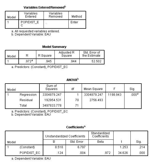 |
| Figure 3: Data calculated in SPSS while running regression analysis |
REJECT
THE NULL HYPOTHESIS DUE TO LINEAR RELATIONSHIP BETWEEN STUDENTS ATTENDING UWEC
AND POPULATION DISTANCE NORMALIZATION.
This
map shows the Standard Deviation of Students attending the University of
Wisconsin-Eau Claire from different counties. The population variable was
normalized to by taking the total population from the county and dividing it by
the distance the center of the county is from the University. The figure shows
one county, Eau Claire County to be over 2.5 standard deviations greater than
the mean. There is also one county that is slightly less than 2.5 Standard
Deviations above the mean, Chippewa County. These two counties are both over 2
standard deviations above the mean because one they are the closest to the
county and two because they contribute a large amount of students to the
university, most likely due to its closeness. Other areas we see have above the
mean standard deviations of significant levels are the Madison, Wausau and
Green Bay areas (Dane, Marathon and Brown County). These counties are
significant because of their large populations and for Marathon County, its
closeness to UWEC (figure 4)
 |
| Figure 4: Standard Deviation Mapping residuals from the first hypothesis |
Hypothesis two: Students attending the University of Wisconsin-Oshkosh
Based on Population Distance Normalization
Variables
being tested: Number of students attending UWO from each county and the
population distance normalization variable (independent).
R2
= 0.919 at a significance level of 0.000
Equation
= Y = 13.887 + 0.076(x)
Data
attained from Figure 5
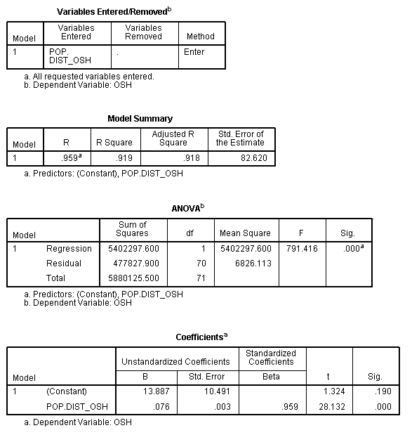 |
| Figure 5 |
REJECT
THE NULL HYPOTHESIS DUE TO LINEAR RELATIONSHIP BETWEEN STUDENTS ATTENDING UWO
AND POPULATION DISTANCE NORMALIZATION
The
University of Wisconsin Oshkosh is located in eastern Wisconsin and about in
the middle of the eastern portion of the state. The map created shows a few
counties above the non-significant (-0.5 – 0.5) range. We see two counties
touching Winnebago County that are above the mean standard deviation (Outagamie
and Fond du Lac Counties). Four counties not within contact but still provide a
large number of people to UWO include Brown, Dane, Milwaukee and Waukesha
Counties. Each of these counties have at least one largely populated city which
probably contributes to the high number of students attending UWO (Madison,
Milwaukee, Green Bay and Waukesha). This test did not show any counties to be
below -0.5 standard deviations of the mean suggesting a possible low enrollment
mean per county and then a couple outliers such as Milwaukee County which would
then make for a large standard deviation (figure
6).
 |
| Figure 6 |
Hypothesis three: Students attending the University of Wisconsin Eau
Claire and Percentage of People with Bachelor’s Degrees in Home Counties
Variables
being tested: Number of students attending UWEC and Percentage of people with
Bachelor’s Degrees in Home Counties (independent variable)
R2 = 0.121 at
a significance level of 0.003
Equation = Y = -126.472 –
4283.038(x)
Data attained from Figure 7
 |
| Figure 7 |
REJECT
THE NULL HYPOTHESIS DUE TO LINEAR RELATIONSHIP BETWEEN STUDENTS ATTENDING UWEC
AND THE PERCENTAGE OF PEOPLE IN THE RESPECTED COUNTIES WHO HAVE BACHELOR
DEGREES
With
this map we see multiple counties with different colors. Again the redder the
county the further away, positive direction, the county’s residual is from the
expected value or mean. Again we see the Madison and Milwaukee areas to be very
high above the expected value. This can again be contributed to larger city
status and possibly jobs in the area require a higher form of education. Other
counties such as Menominee and Trempealeau Counties are below the standard
deviation or expected value, and this could be because in Menominee not many
people have Bachelor’s Degrees because it is not needed since they are
basically a closed off reserve. Basically when looking at this map, several of
the counties in red shades are home to larger cities, while blue are smaller
more farm/forested areas, with the exception to Bayfield County (figure 8).
 |
| Figure 8 |
Hypothesis four: Students attending the University of Wisconsin Oshkosh
and Percentage of People with Bachelor’s Degrees in Home Counties
Data attained from Figure 9
Data attained from Figure 11
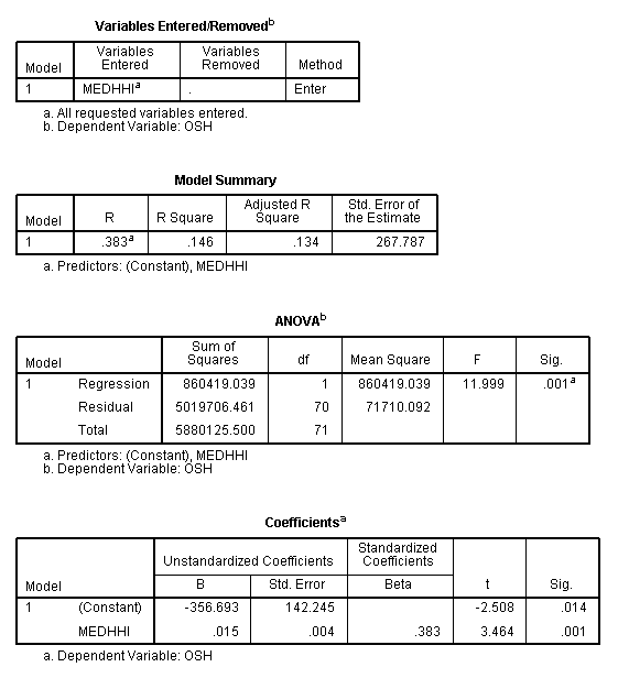
Hypothesis six: Students attending the University of Wisconsin Oshkosh
and the relationship it has with the median household income of the respected
counties.
Variables
being tested: Number of students attending UWO and Percentage of people with
Bachelor’s Degrees in Home Counties (independent variable)
R2
= 0.129 at a significance level of 0.002
Equation
= Y = -187.382 + 5733.635(x) Data attained from Figure 9
 |
| Figure 9 |
With
this map we see multiple counties with different colors. Again the redder the
county the further away, positive direction, the county’s residual is from the
expected value or mean. Here we see Winnebago and Outagamie Counties to be over
2.5 Standard Deviations above the mean or expect value. Milwaukee and Brown
County are in the category right below those two. Several Counties spread out
across the state are in the negative standard deviations and this could again
contribute to a smaller population or more farm land then built up areas (figure 10).
 |
| Figure 10 |
Variables
being tested: Number of students attending UWEC and median household income in
Home Counties (independent variable)
R2
= 0.007 at a significance level of 0.104
Equation = Y = -80.928 + 0.006(x)Data attained from Figure 11
 |
| Figure 11 |
FAIL
TO REJECT THE NULL HYPOTHESIS DUE TO NO LINEAR RELATIONSHIP BETWEEN STUDENTS
ATTENDING UWEC AND THE MEDIAN HOUSE HOLD INCOME IN THE RESPECTED COUNTIES
Because
this data was not considered to be significant at 95% significance level the
residuals were not mapped. This being said I did not find a significant enough
linear relationship amongst the two variables and therefore failed to reject
the null hypothesis.
Variables
being tested: Number of students attending UWO and median household income in
Home Counties (independent variable)
R2
= 0.146 at a significance level of 0.001Equation = Y = -356.693 + 0.015(x)
Data attained from Figure 12
 |
| Figure 12 |
In
the map we see a general split running diagonal across Wisconsin, with the
exceptions to Marathon, St. Croix, Pierce and Wood Counties. The counties left
of the diagonal line are below the standard deviation, and I believe this may
be the case of vastly wooded areas as well as smaller populations where there
is not much high income people claiming permanent residence in those locations.
In the southeastern and eastern portion of Wisconsin we see most of the red
counties in the state. This is meaning they are above the expected value. This
could be because of two reasons, one they are in close proximity to Oshkosh and
two they have larger cities with largely built up areas that have higher income
levels (figure 13).
 |
| Figure 13 |
Discussion
Residuals for each of the 5
hypotheses that rejected the null hypothesis.
When
looking at the residual values for the five significant hypotheses we see as
the r squared value decreases, or gets closer to zero, the range between the
minimum and maximum residual values increases. Along with the increase in range
between the two values the standard deviation also increases. Using this
information, for example, Image1 has an r2 value of 0.945. This is
seen as a near perfect line. Then when we look at the minimum value (-291.793)
and the maximum residual value (156.910) we see that the range is only 448.703.
Now if we take a look at Image6 that had an r2 value of only 0.146.
We see the minimum residual value (-368.859) and the maximum residual value
(1906.635) have a range of 2275.494 and a standard deviation of 265.895. In
this lab when it comes to dealing with the residual values and standard
deviations, it appears that there is a direct link between the r squared value
and the range between the maximum residual value and the minimum residual
value.
Image
|
R2
|
Minimum Residual Value
|
Maximum
Residual Value
|
Range
|
Standard
Deviation
|
Image1
|
0.945
|
-291.793
|
156.910
|
448.703
|
52.131
|
Image2
|
0.919
|
-351.387
|
404.019
|
755.406
|
82.036
|
Image3
|
0.121
|
-264.069
|
1603.142
|
1867.211
|
208.129
|
Image4
|
0.129
|
-321.330
|
1864.982
|
2186.312
|
268.627
|
Image6
|
0.146
|
-368.859
|
1906.635
|
2275.494
|
265.895
|
|
Image
|
+/-2.5 Standard Deviations
|
Minimum Residual Value
|
Maximum Residual Value
|
|
Image1
|
+/-130.32
|
-291.793
|
156.910
|
|
Image2
|
+/-205.09
|
-351.387
|
404.019
|
|
Image3
|
+/-520.3225
|
-264.069
|
1603.142
|
|
Image4
|
+/-671.5675
|
-321.330
|
1864.982
|
|
Image6
|
+/-664.7375
|
-368.859
|
1906.635
|
As
the table shows above three of the five images (3,4 and 6) minimum value do not
come close to the -2.5 standard deviations value, this is the primary reason to
why the maps are so yellow (-0.5 to 0.5 standard deviations) or light blue
(-0.5 to -1.5 standard deviations).
No comments:
Post a Comment